
A sufficient amount of time – required for a thorough description of the Report page analyzer – is lacking a bit on my side at this very moment. However, I want to give a sneak peak of what the Report page analyzer is capable of. Here we go!
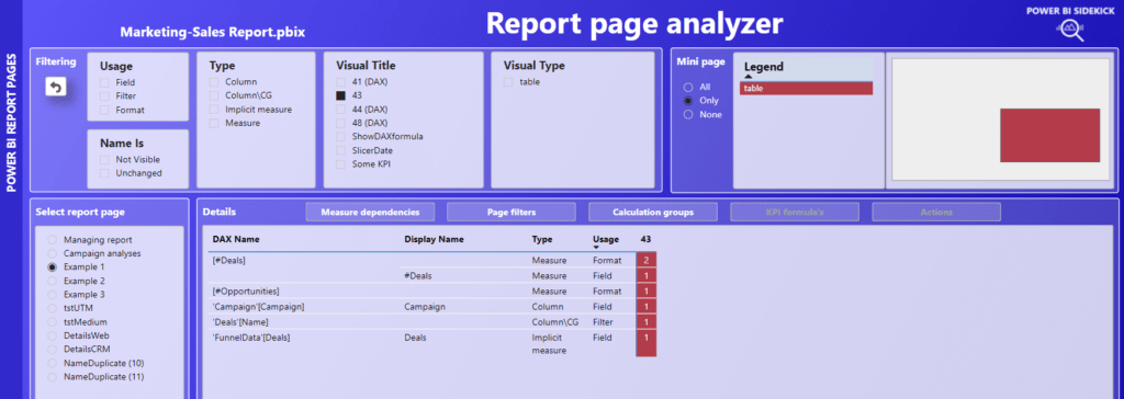
As you can see in the screenshot of the entire page above, most of the space is taken by a matrix, that shows all columns and measures that are being used in the visual objects on this page. Around the matrix, there are slicers and buttons available to zoom in further on what exactly is going on in each object. The target here is for each page in the report to retrieve full insights and understanding from this Report page analyzer page alone. Let’s briefly discuss the parts around the matrix.
Select report page – left
As a starting point, the external tool Power BI Sidekick has run from and over the local Marketing-Sales Report.pbix file in Power BI Desktop. For this example we have selected the page ‘Example 1’ on the left side.
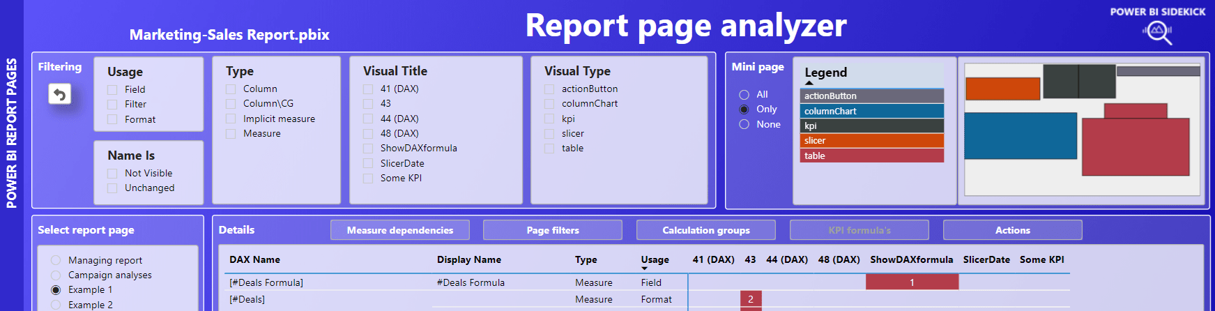
Filtering – top left
There are 5 slicers available to zoom in on the visual objects on the page.
- Usage – Select whether the columns/measures are used as a field in the visual, as a visual level filter in the filter pane or in the background in the Format section of the visual.
- Name Is – Select whether name is not visible (being in Format or Filter), unchanged (Display name is DAX name) or renamed (Display name is changed in Fields).
- Type – In case of columns, select whether it functions as a regular column (being a dimension) or as an implicit measure or as a calculation group item (Column\CG).
- Visual title – Select visuals by title. When the title name is not changed by the user, it shows a number. Recognize dynamic titles by a number plus postfix (DAX).
- Visual type – Select the visual type if desired. The mini page visual and legend on the top right can be helpful here.
Mini page – top right
The impact of the filtering section is directly visible in the top right Legend and Mini page visual, since only the visual objects are shown within the selection. Notice also the slicer to the left of the Legend:
- All: shows all visual objects on the page
- Only: shows only visual objects containing columns and/or measures in the Field, Filter or Format section.
- None: shows all visual objects without columns and measures.
Details – five buttons above the overview matrix
Depending on the selection of visual objects, the five buttons are white or greyed out. White betrays relevance and by clicking, you’ll be redirected to a seperate detail page. For returning back to the main page, press the POWER BI REPORT PAGES bar on the left. Let’s go over them one by one:
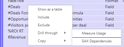
Measure dependencies
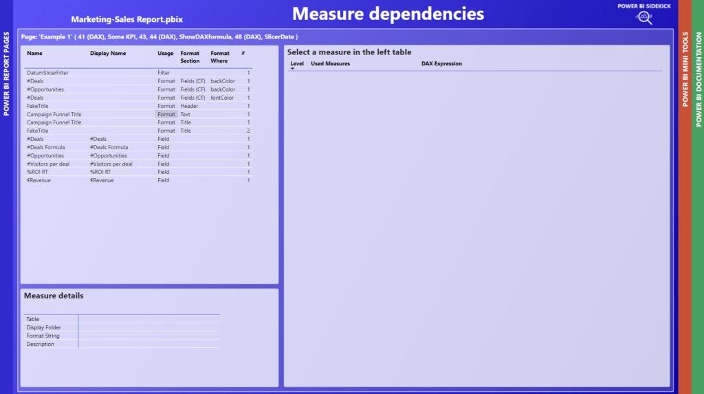
This detail page shows more details about how each measure is used within the selection you picked. To fill the Measure details left bottom and DAX dependencies on the right, press on a measure in the left top table:
Details like display folder and description are shown below, the full flow of DAX dependencies are shown on the right. Very helpful to quickly evaluate used logic. Also for walking through the logic with the customer together.
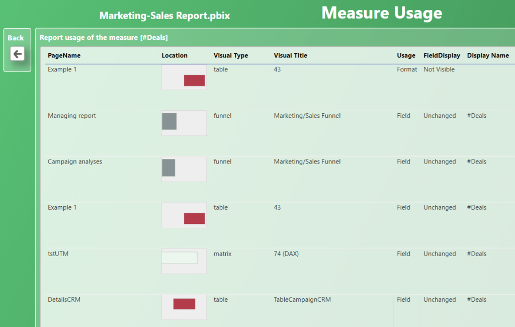
But wait, there is more. What if you consider to change the formula of a measure, for instance [#Deals] as being used on this page. Wouldn’t you like to check first whether [#Deals] is used elsewhere in the report, be it by other visuals or as a reference in other measures?
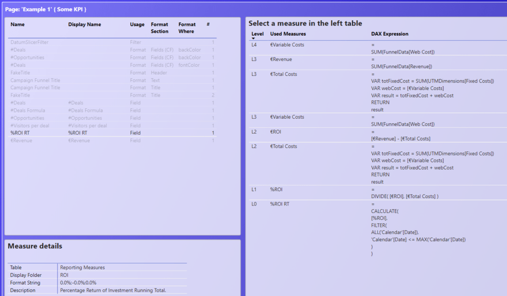
You can retrieve this information by hovering over the measure on the left table. A tooltip page pops up and shows where and how the measure is used:
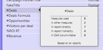
We see that [#Deals]
- refers to 0 measures in it’s own DAX expression (Measures used)
- is referred 2 times by other measures (In other measures)
- is used in 7 visual objects in the report (In report directy)
- is used 4 times by other measures that are used in a visual and are refering to this measure in their formula (In report indirectly)
- is used 0 times for building DAX columns or tables
For completeness sake, the text on the bottom shows the scope of the analysis. In a live-connection-with-thin-reports scenario, it is possible to select a subset of the reports. This will be mentioned here. In our example, there is just one report file, hence the ‘Based on all reports’.
Being it the case, that [#Deals] is used 7 times directly, plus it is referenced by 2 other measures, which also are used in reports 4 times, this should raise enough red flags to skip the idea of changing the formula of the [#Deals] measure.
But wait wait, there is more more. You can use drillthroughs to see in what reports and measures [#Deals] is used:
Measure Usage shows the 7 visuals where it is used in the report:
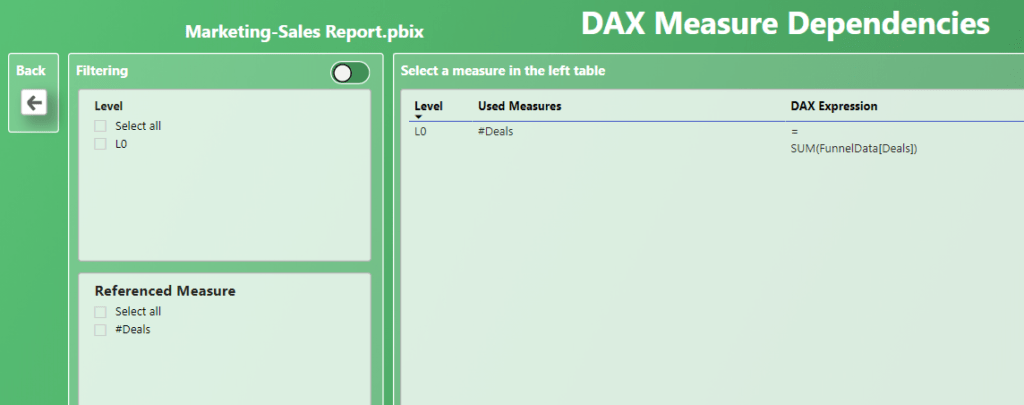
DAX Dependencies shows two directions of refering other measures.
Refering to (toggle on the left):
Refered by (toggle on the right):
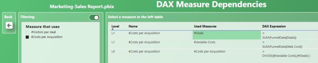
If you select a measure on the left, you’ll see where exactly [#Deals] is used in the other measure. The Back button will bring you back to the Measure details page.
Page filters
Coming soon.
Calculation groups
When calculation groups are involved in the selection of visual(s), the ‘Calculation groups’ button lights up and brings you to the detail page. To demonstrate this, I have zoomed in on visual ’43’ that contains a calculation group item as a visual level filter:
Let’s also have a look at the actual visual in the ‘Marketing-Sales report’, that we are evaluating:
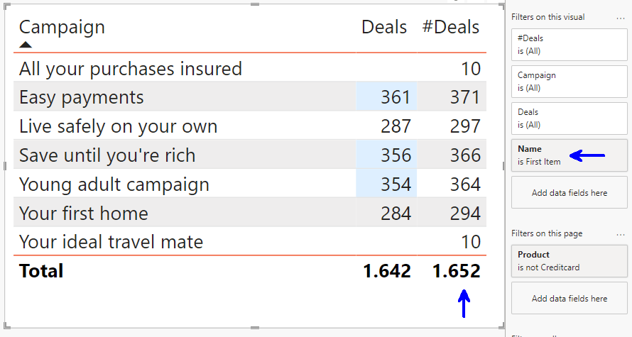
In this table we see the number of deals twice over each campaign. ‘Deals’ is an implicit measure, ‘#Deals’ is a DAX measure, which is just a sum over the Deals-column. Hence you’d expect that both columns return the same figures.
However for whatever reason, the DAX version is always +10. From the naming of the ‘Name is First Item’ filter, it may not be clear that we are dealing with a calculation group. Furthermore we would have to open separate tools to see the DAX expression of the item and fully grasp the calculations at hand.
That is… not anymore. Open the ‘Calculation groups’ details page and click on the relevant item to evaluate the DAX expression:
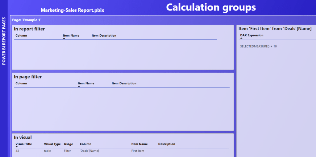
The screenshot is a bit hard to read, so here repeated again:
SELECTEDMEASURE() + 10
The +10 example of course is not very realistic, but chosen for illustration purposes.
KPI formula’s
Coming soon.
Actions
Coming soon.
Multiple reports
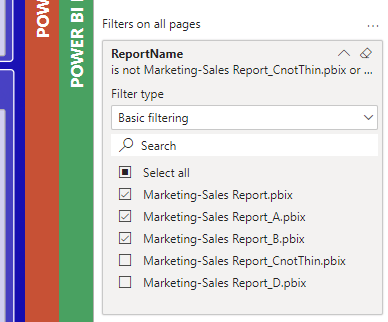
It is possible to evaluate multiple (thin) reports. See the instruction on github Wiki on how to do that.
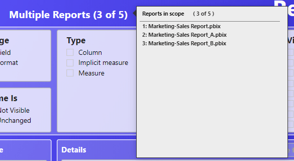
For space considerations, all report page names are prefixed with the number of the report. Hovering over the report title, in the header section, shows the corresponding reports.
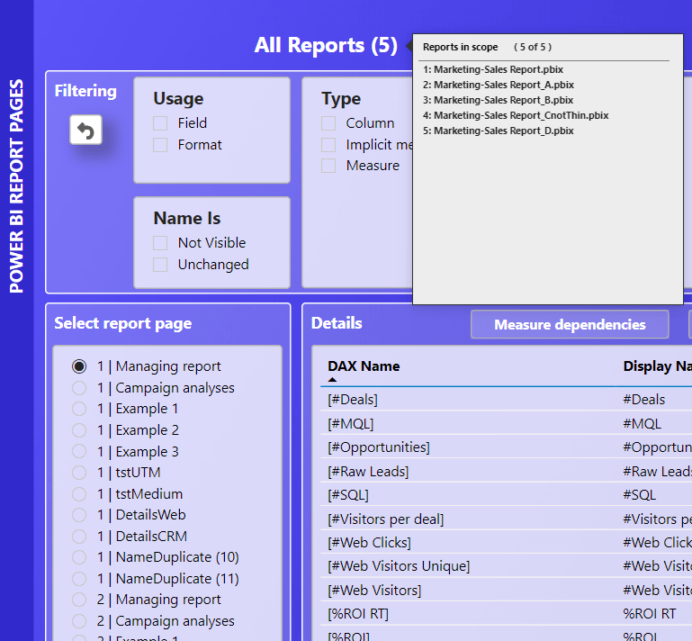
It also is possible to evaluate a subset of the reports by using the filter pane. Here the top 3 reports are selected:
Again the title name and it’s report tooltip, provide information on this selection. Making it visible like this, hopefully prevents the user forgetting that he/she leaves some reports out of the evaluation.
That’s it for now!


